- ROLE
Graphic Designer/Art Director
- FOR
Hilton Hotels/M&D Regional Center
- TYPE
Brochure
- URL
http://www.thesourceoc.com
Presented here is the brochure as single two-page-spreads with the first spread being the brochure COVER where the center of the brochure spread is the center spine.
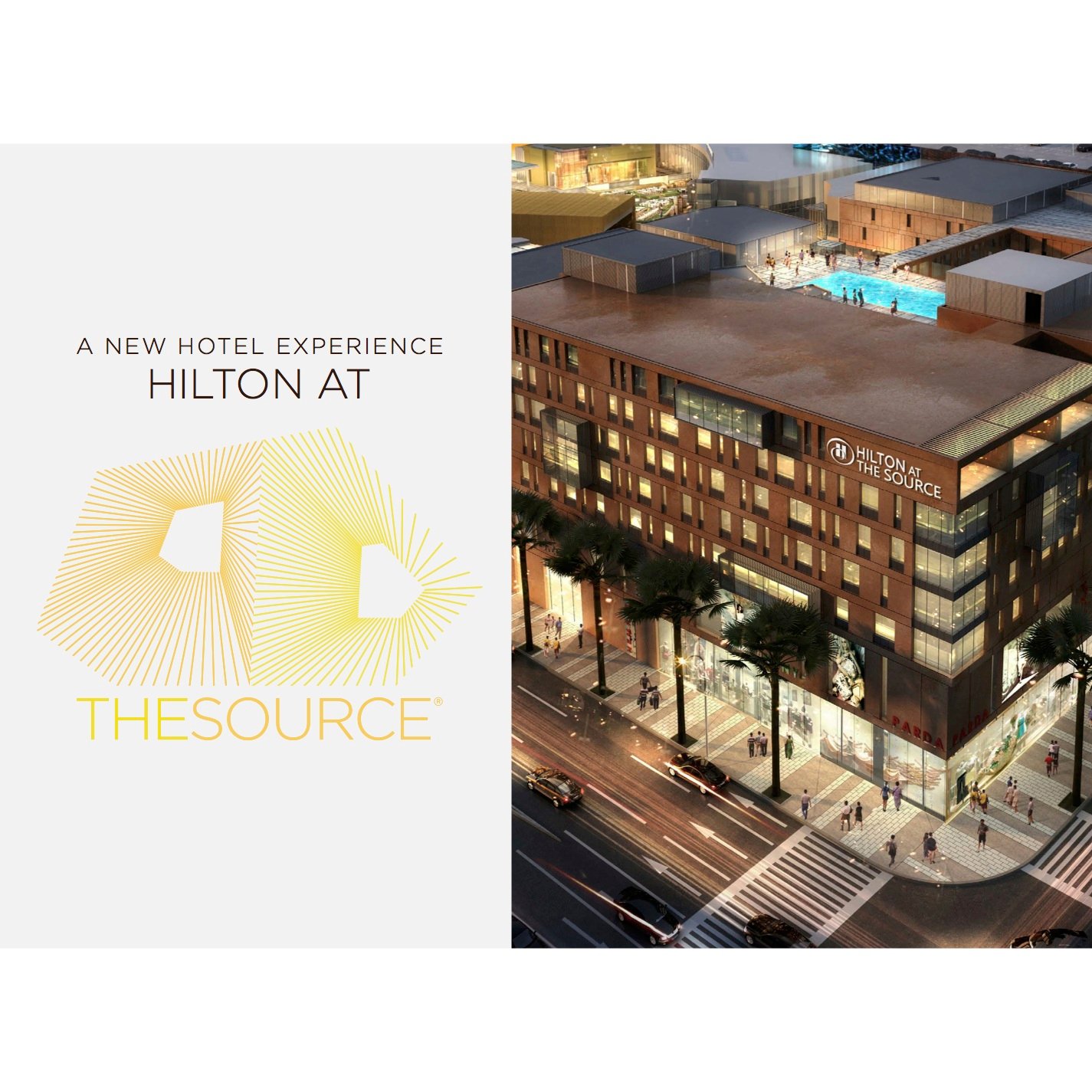
The intent of this 20-page brochure is to inform and encourage potential investors to invest in the completion and management of a 4-star Hilton hotel project. The idea is to elevate the existing brochure design to a higher level to reflect the elegance, modern ‘dark wood meets metal’ feel of the proposed 5-Star Hilton Hotel. I chose an art direction that had to feel modern and elegant so I used the retail destination logo that the Hilton will be part of, ‘THE SOURCE’ to add splashes of visual energy throughout the brochure and connect the hotel to the overall retail development. Printed on high quality smooth paper stock, looks AND feels ‘upscale’.
The square format allowed for the layout to breath and have open spaces, which suggest affluence, modern clean layout design, architectural magazine design, fashion conscience suggestions.
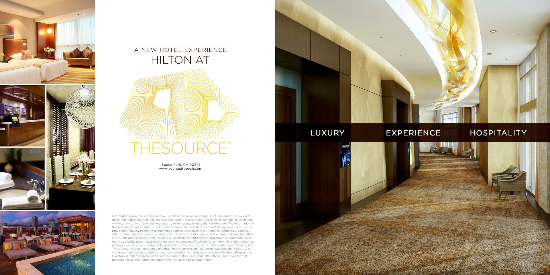
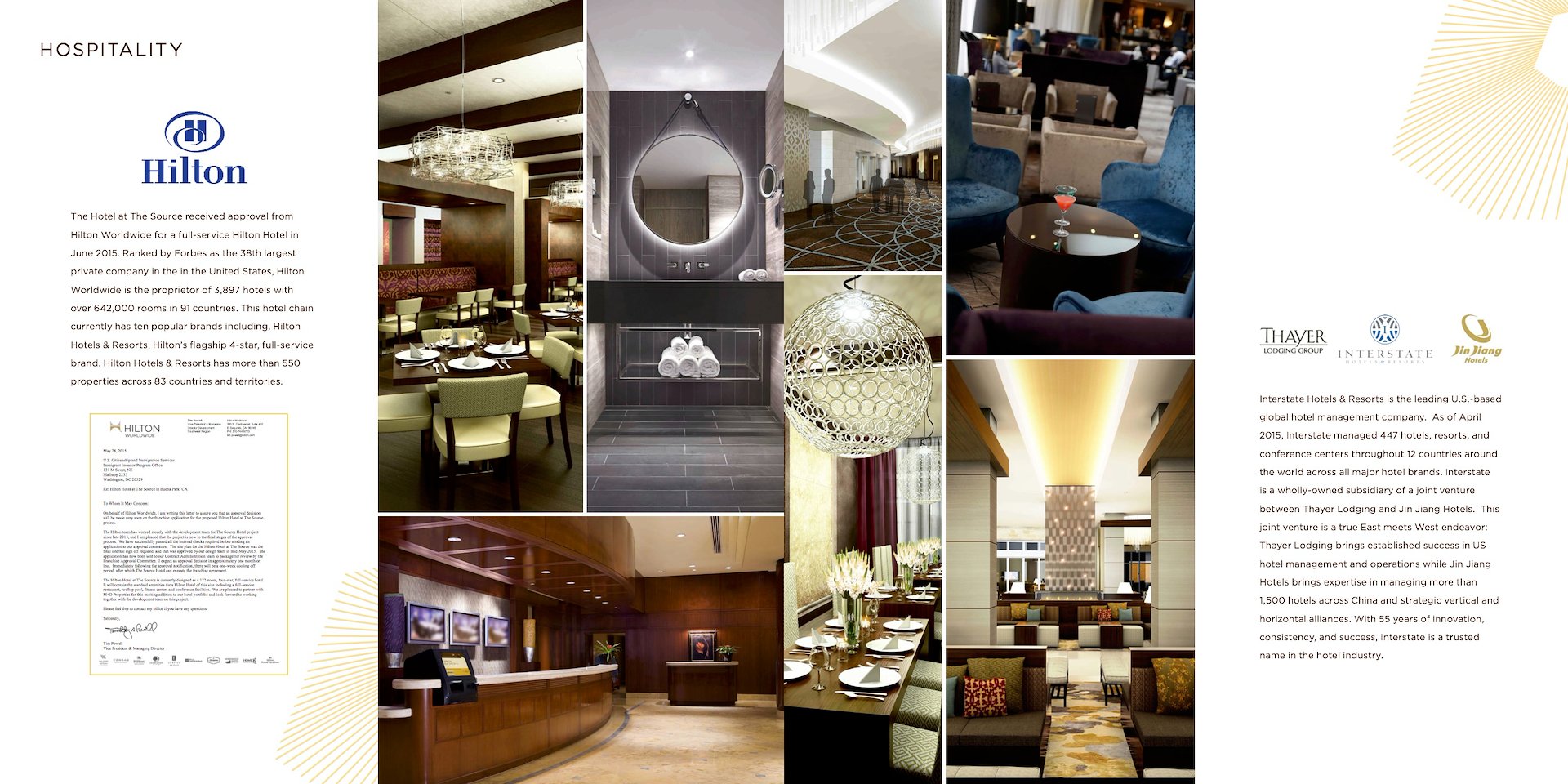
I was given access to Hilton’s high resolution photos of their existing hotels and I chose the closest that reflected and visually translated not only the under-construction hotel but it’s color and material scheme. I’m telling a visual story so the elevators with a clean modern elegant typographical banner invites the reader into the project.
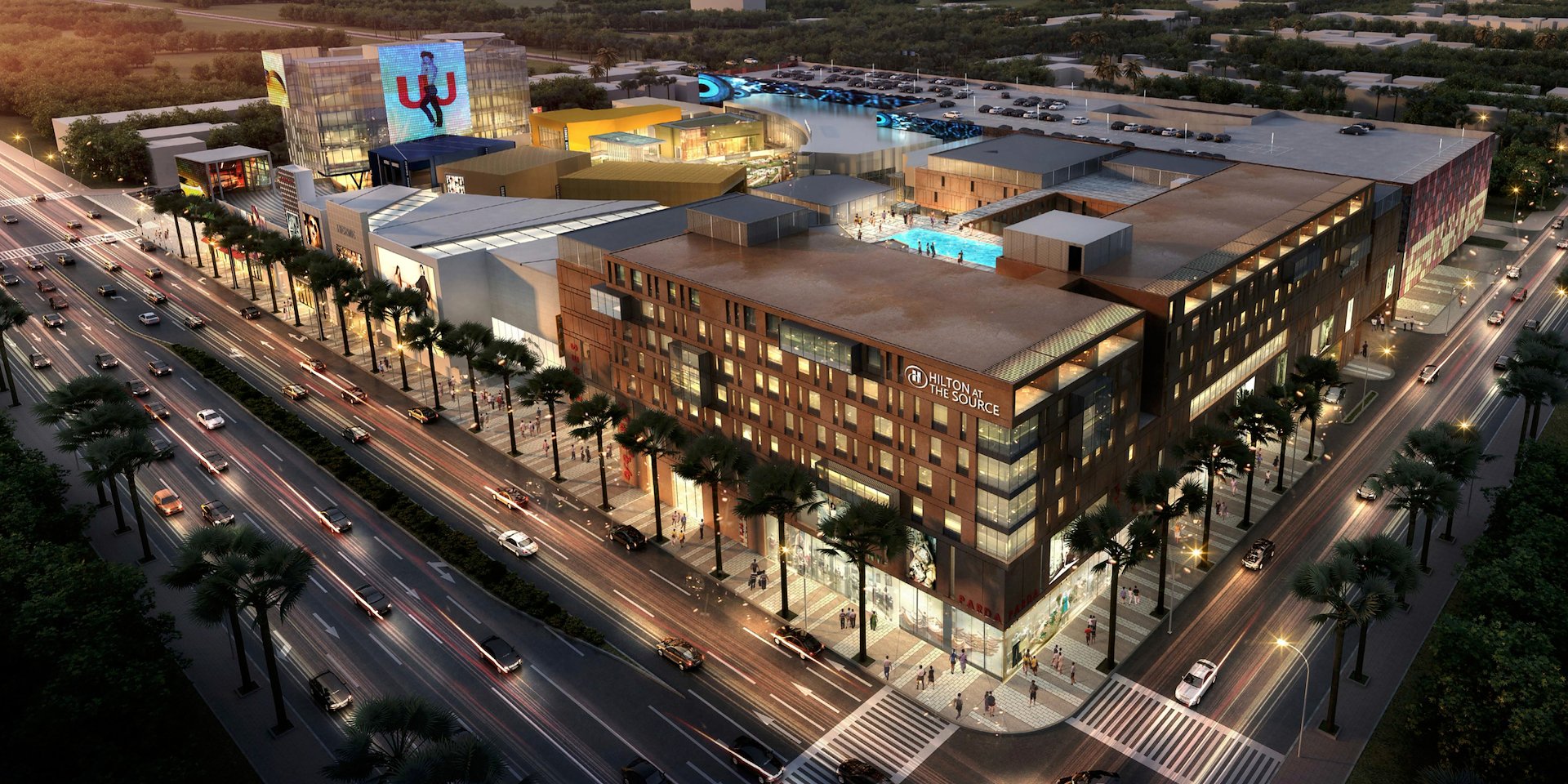
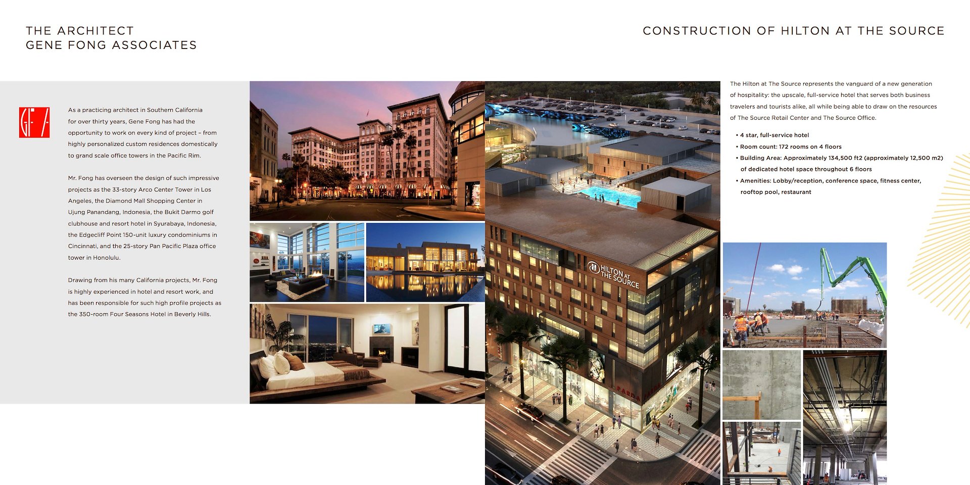
The client had very little in the way of content for the construction other than this one very nice rendering for the hotel. I chose this and added the “HILTON” logo ON the building using Photoshop CC.
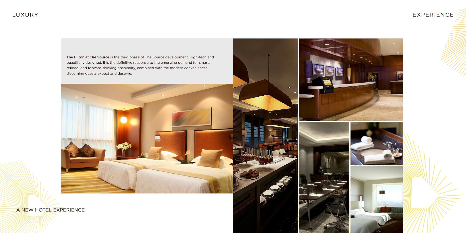
I chose images for the image board from the HILTON hotel high resolution image archive that matched the look and feel of the Hilton At The Source. Note the use of the interesting spiral graphic element from THE SOURCE logotype. You’ll see this repeated tastefully and carefully throughout the layout spreads. I did this to add a bit of “magic” and elegant sparkle to the overall page layout design. Looks great and is a running visual cohesive element in the brochure.
It was tricky balancing official documents with image boards and a clean open layout design, adding THE SOURCE logo graphic was my touch at adding a dash of “magic” and energy to otherwise somewhat dull documentation presentations.
Typography was kept minimal in terms of visual impact. The kerning of each page header reflected the elegant spacial feeling I was going for, plus I’m always leading the eye into directions.
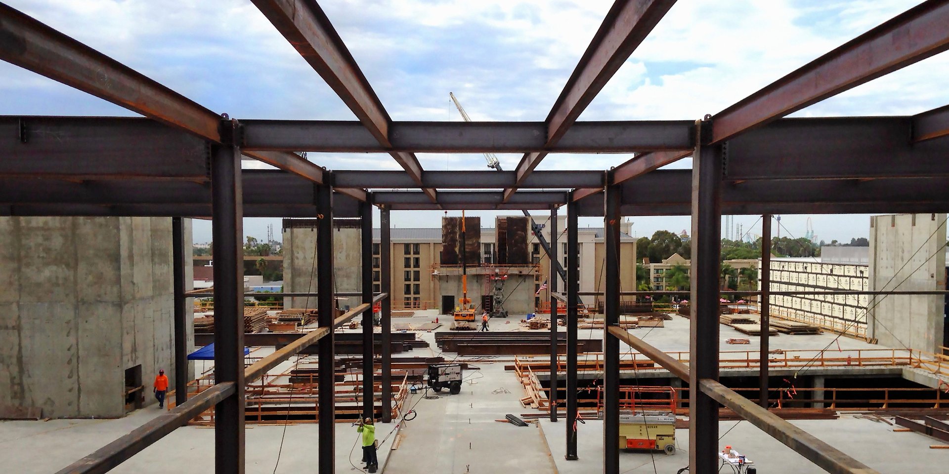
Again, the client had little in the way of dramatic photos of the construction site so I requested an opportunity for a photoshoot of my own at the construction site and took many photos one of which I used for this dramatic spread. I enhanced it in Photoshop CC and we chose it to show actual progress in construction of the Hilton At The Source. I am an all-hands-in type of designer and will get dirty if I have to to achieve my visual communication goals!
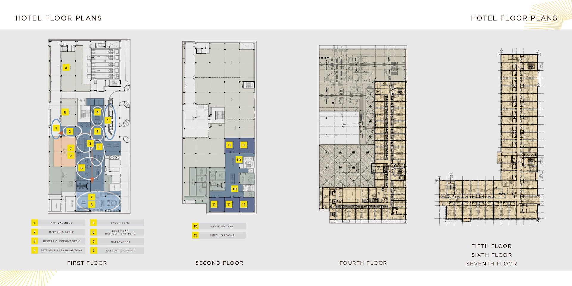
I love floor plans. Because it becomes very technical which is another part of my passion in graphic design, the balance of technicality and creativity.
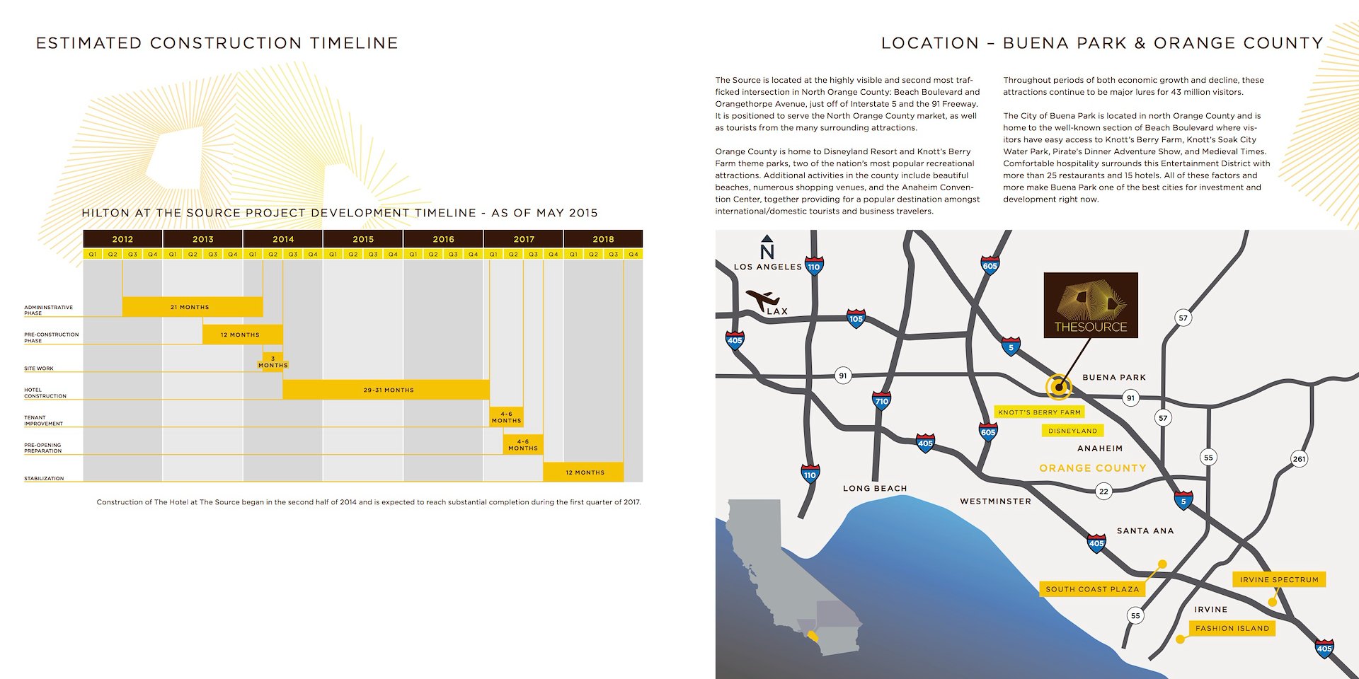
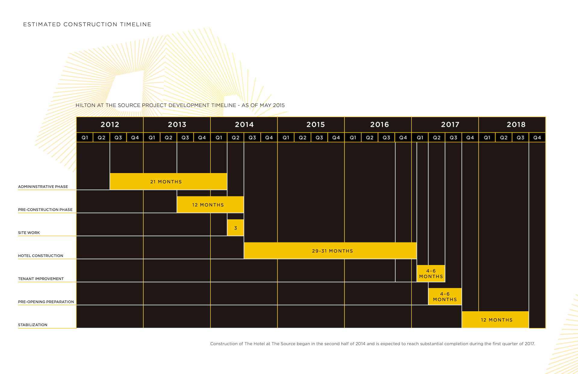
I love to take non-designer information and create clear, immediatley understandable info-graphics-like designs. I used Adobe Illustrator CC to create this and placed it as a PDF into InDesign CC applying a sort of UI inspired approach and applying the look and feel I was going for in terms of color and type, etc.. Same with the map. I actually took an existing map provided to me and stripped it of clutter, clarified the highways, etc. and applied the look and feel of the brochure to the map.
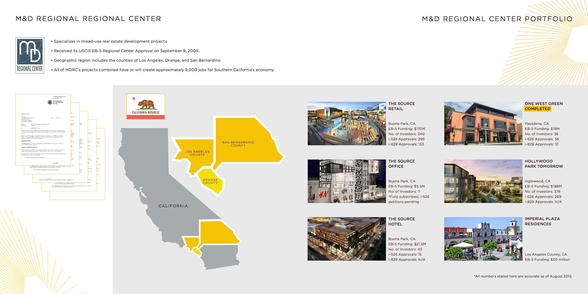
The client’s first version of this brochure was very non-designer, and they had collected and used very low quality internet found imagery, so I had to recreate the California state shape and southern California counties for an interesting visual solution.
Careful typography that honestly, just comes naturally as I see other visual elements on a page. My goal was achieved: to provide the client with a completely new and elegant art direction for this project that they can use and branding efforts in the future. Can’t wait until we see the Hilton hotel up and running!
THE SOURCE HOTEL BROCHURE-HILTON TIMELINE ALTERNATIVE ‘DARK CHOCOLATE’ VERSION.
/background(fff)/1920x1483.jpeg?auto=webp)