- Experiential Graphic Design [XGD] Kahramaa Energy Awareness Park
- ROLE
Graphic Designer/Art Direction/XD Design
- FOR
MCM Group International/Qatar General Electricity & Water Corporation
- TYPE
Clean Energy Museum – Large-Scale Exhibit + Environmental Graphics – Qatar
- URL
https://www.mcmgroup.com/practices/cultural-heritage/kahramaa-awareness-park/
I designed large-scale environmental graphics and signage for a major museum project in Doha, Qatar, focused on energy conservation and education for K–12 audiences. My role was to build on existing visual assets and develop new, engaging graphic solutions for a variety of science-based exhibits.
Working closely with the lead architectural firm, I was given creative freedom to push the visual language in a more dynamic, youth-focused direction. This included wall graphics, exhibit panels, educational plaques, directional signage, and wayfinding systems that supported both visitor engagement and spatial clarity.
Throughout the project, I transformed complex engineering, scientific, and environmental content into visually compelling, easy-to-read layouts in both English and Arabic. The final designs balanced clarity, hierarchy, and color to create an immersive learning environment aligned with the mission of the Kahramaa Awareness Park.
Learn more about Kahramaa Awareness Park
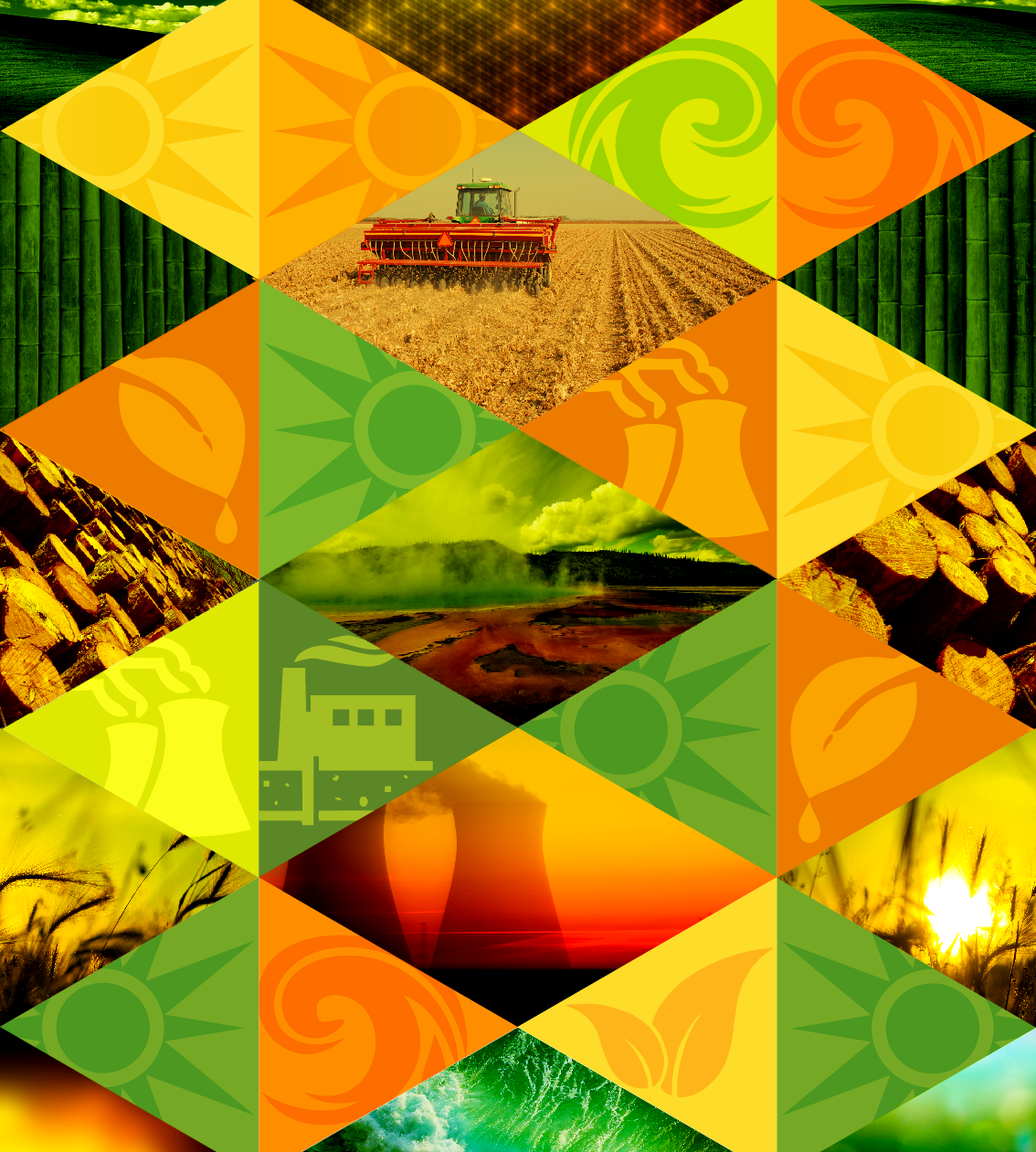
This decorative centerpiece is a four-sided, backlit tower approximately 2600 mm tall, positioned within an exhibit zone focused on alternative energy technologies for children.
The tower was conceived as an art piece designed to captivate visitors and visually express the natural elements behind alternative energy, while integrating the exhibit’s thematic colors, triangular forms, and iconography. The layered imagery and geometry work together to create a vibrant focal point that reinforces the overall exhibit narrative.
Included below is a photo of the physical paper model I created for the client as a scaled reference for form, proportion, and lighting effects.
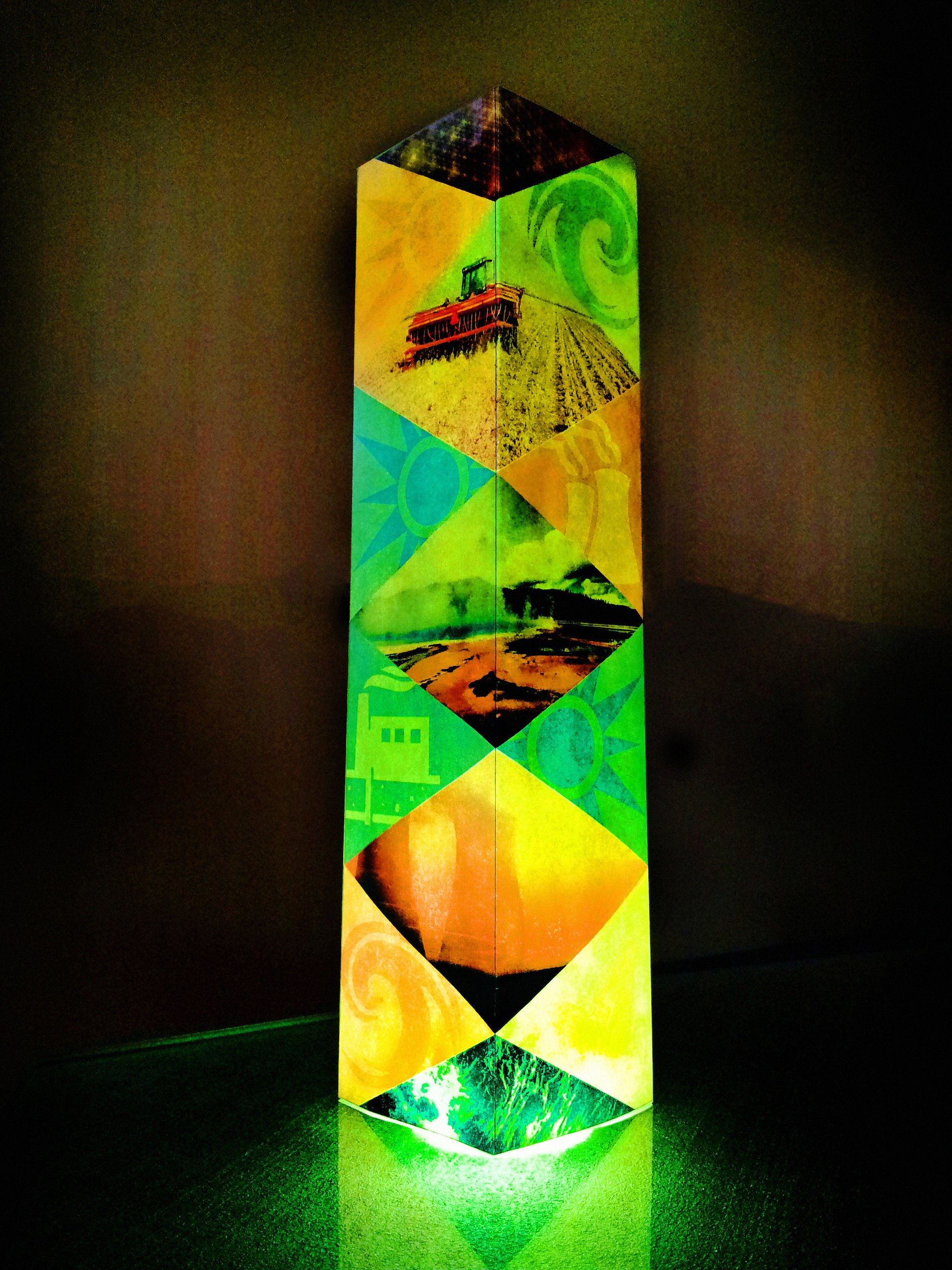
To help the client visualize the concept, I created a tabloid-sized paper model that demonstrated how the graphics would wrap continuously around the four-sided tower. This physical mockup clarified both the design intent and how the piece would function within the space.
I photographed the model on a glass conference room table, using a flashlight from below to simulate backlighting, then enhanced the imagery in Photoshop to approximate the final illuminated effect. The wrapped graphics and dynamic lighting were designed to create an energetic, vibrant mood that encourages visitors to walk around the tower and experience the piece from all sides — a direction the client was very enthusiastic about.
/background(fff)/1920x1920.jpeg?auto=webp)
Large-format infographic panels designed for a museum exhibition, translating raw scientific content into clear, engaging visual narratives for visitors.
I was responsible for every aspect of these panels, including the Arabic typography and bilingual layouts, ensuring that complex information was accessible, legible, and visually cohesive for both English- and Arabic-speaking audiences.
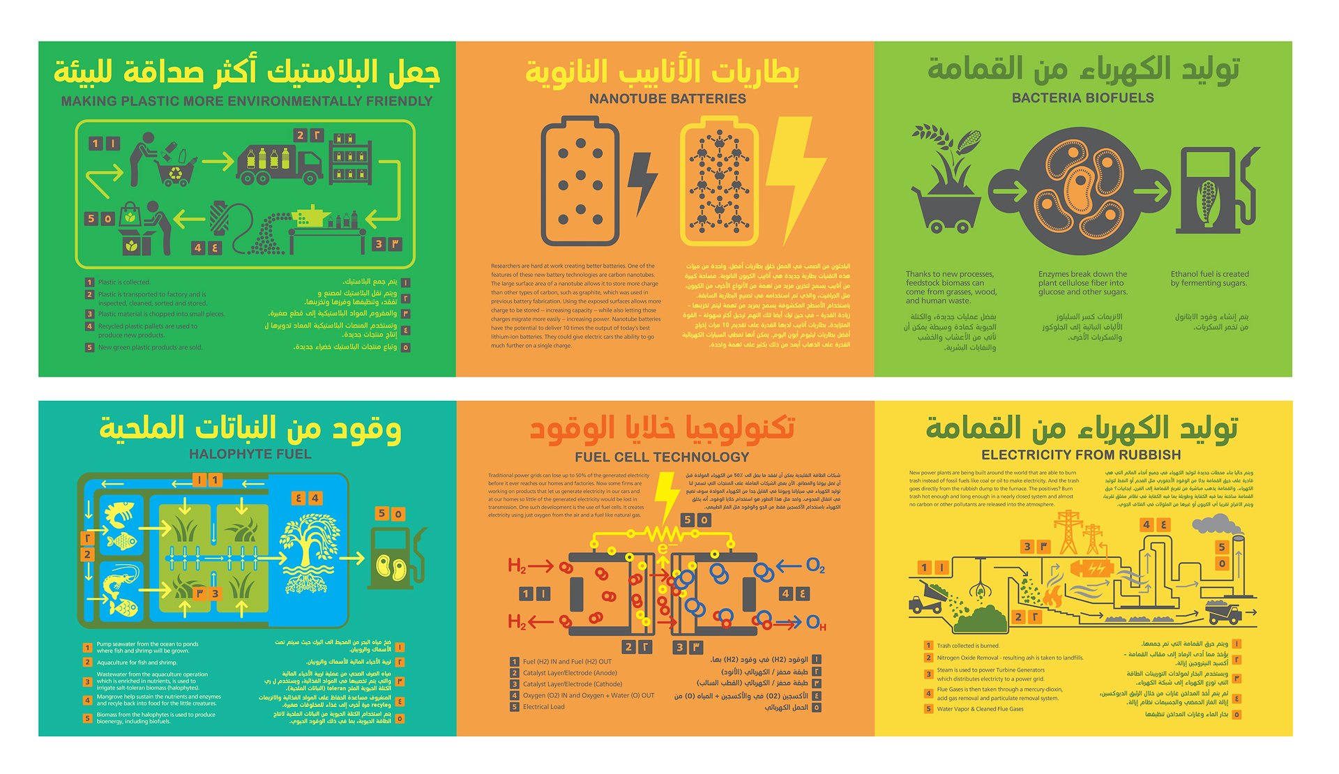
Close-up views of large-format exhibition infographic panels, showcasing the level of detail in both the visual design and the underlying content.
For these panels, I conducted research to source and verify the scientific information, then structured it into clear, hierarchy-driven layouts. The result is a set of infographics that balance accuracy, readability, and visual engagement at museum scale.
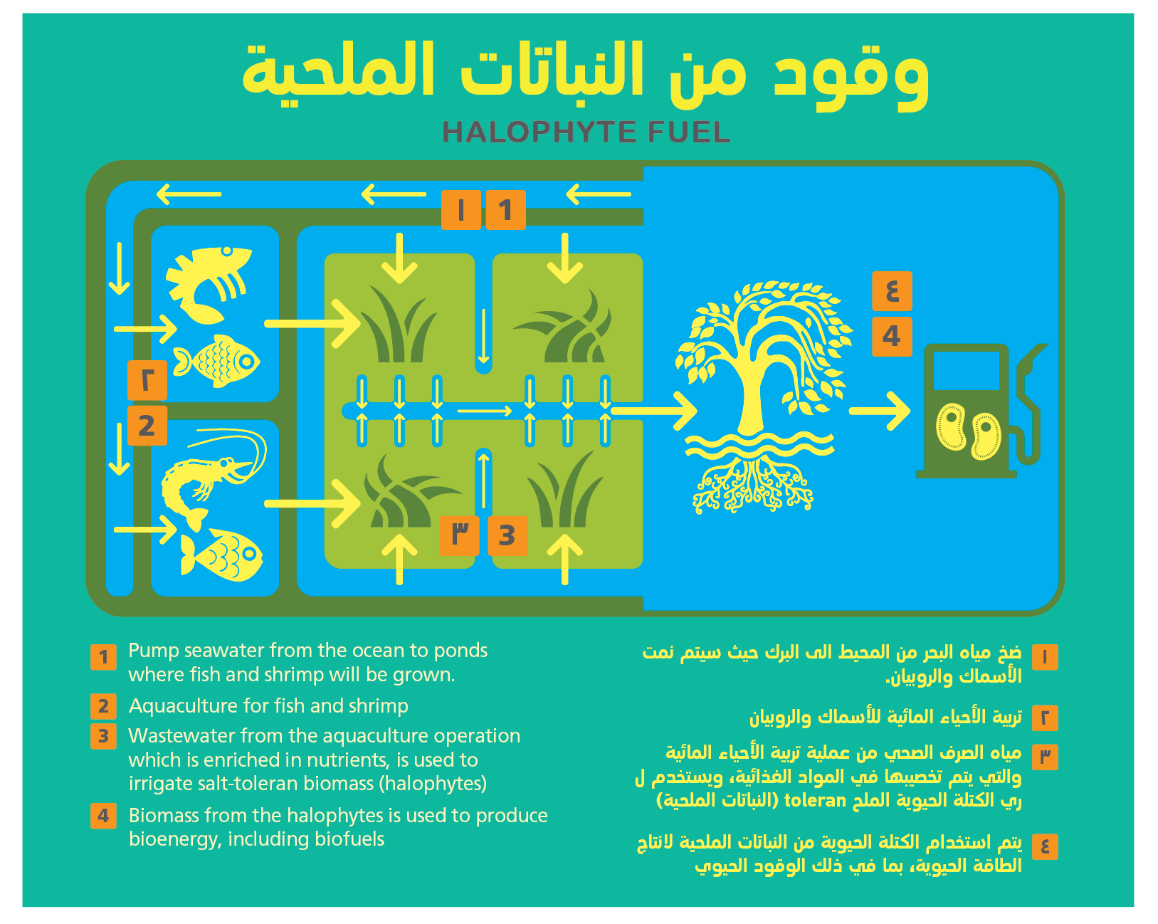
Visually engaging educational graphics illustrating various “future green energy” methods, designed specifically for younger audiences.
The visual approach takes inspiration from UX and modern digital interfaces to resonate with children and teens, balancing playful, child-like elements with clean, icon-driven clarity. After researching each topic, the information was distilled into simplified symbols and iconography reminiscent of contemporary smartphone interfaces, making complex concepts feel intuitive and approachable.Visually engaging educational graphics that show ‘future green energy’ methods.
I chose a UX inspired direction because it will appeal to the younger audience that the museum is targeting their exhibits to. It’s a balance between engaging children and teens with simple child like graphics.
Research was done, and I simplified the lessons down to symbols that reflect modern smartphone interfaces and iconography.
/background(fff)/1920x1151.jpeg?auto=webp)
**Future of Power – Hanging Large-Format Banners**
Series of hanging large-format banners designed to introduce a “Future of Power” theme within the museum.
These graphics were developed with an eye toward future expansions of the exhibit, exploring a darker, more atmospheric visual language with organic forms and lighting-inspired motifs. The goal was to establish a flexible design direction that could anchor new sections of the museum while still feeling cohesive with the existing environmental graphics.
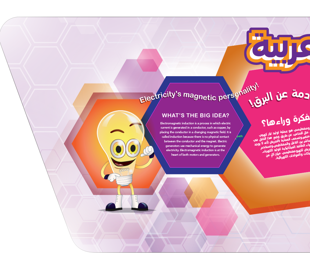
Transforming existing content and preliminary designs into a more cohesive, “magical” visual experience for a youth-oriented museum environment.
I reworked inherited graphics that were originally busy, flat, and loosely structured, recomposing key elements to create a clearer sense of spatial depth and narrative for the exhibit’s characters. By reintroducing lavender tones, tightening the hexagon grid, and adding subtle glow and motion cues, I established a more immersive visual “world” that feels alive and engaging rather than static.
Typography and language were also critical: I developed solutions for integrating Arabic text alongside English, using additional software and careful typographic planning to ensure both languages felt balanced, legible, and harmoniously integrated within the overall design system.
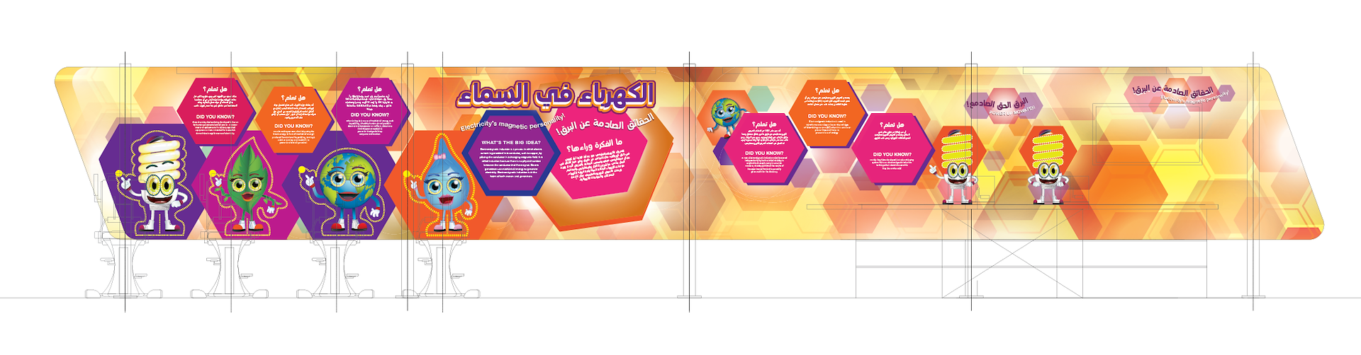
In this example, my role was to redesign existing layouts, develop new compositions, and bring a more “magical” sense of depth and order to the visual system. I also had to establish a practical workflow for working with Arabic text, including line breaks, paragraph rags, and bilingual hierarchy — a challenge that ultimately led to a more refined and consistent typographic approach across the exhibit.

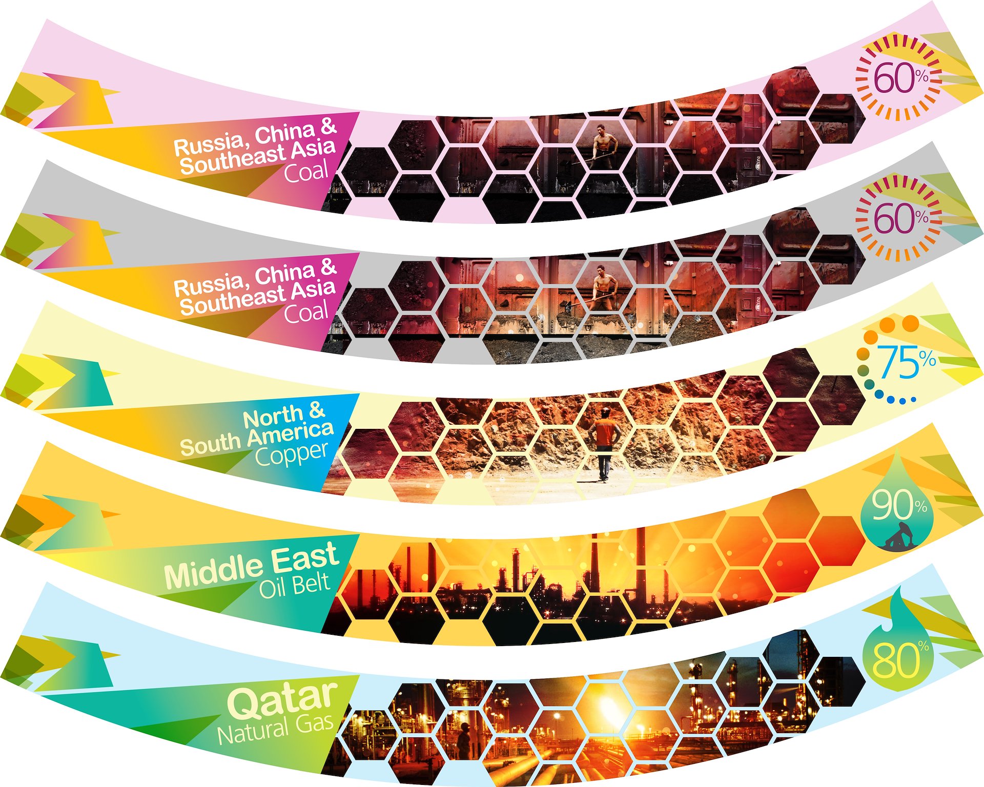
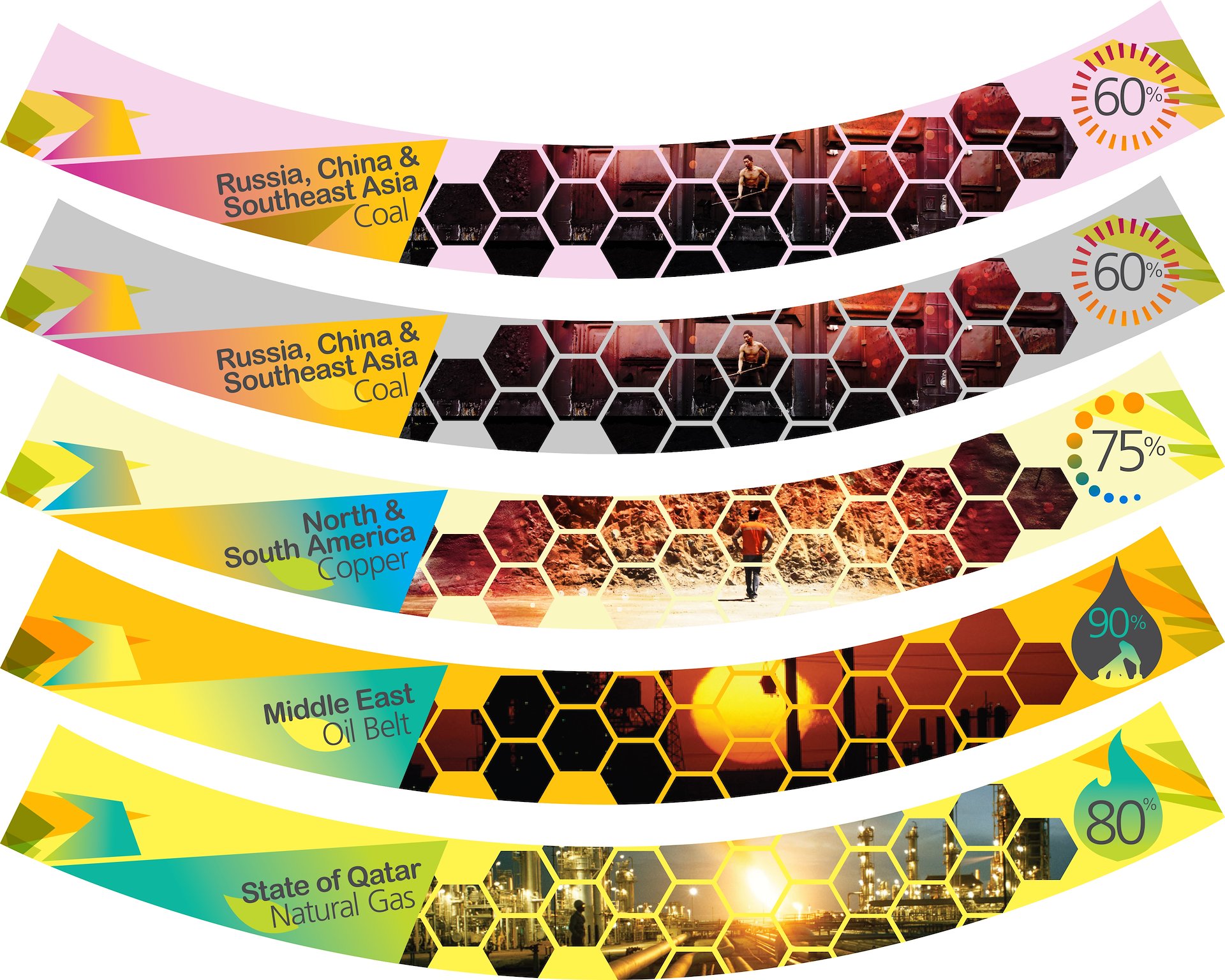
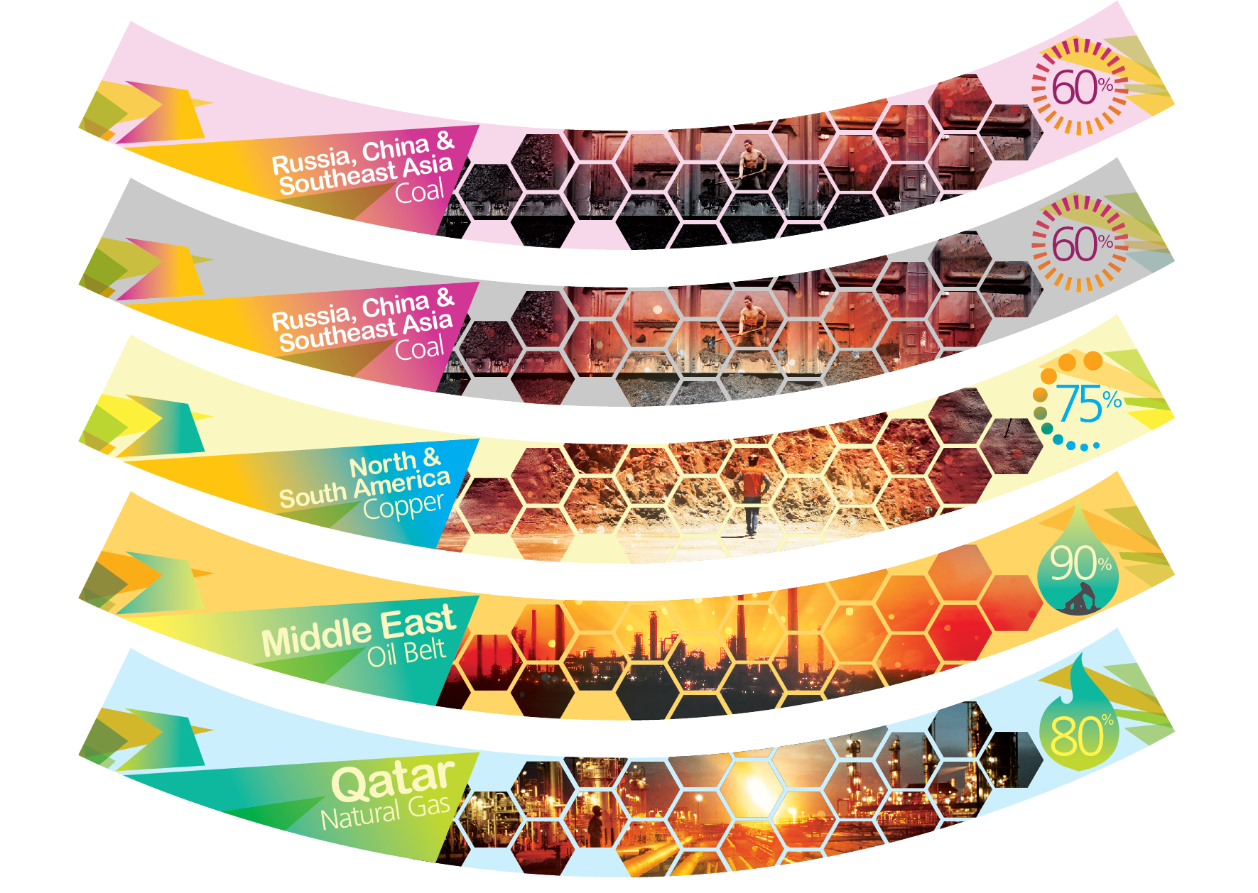
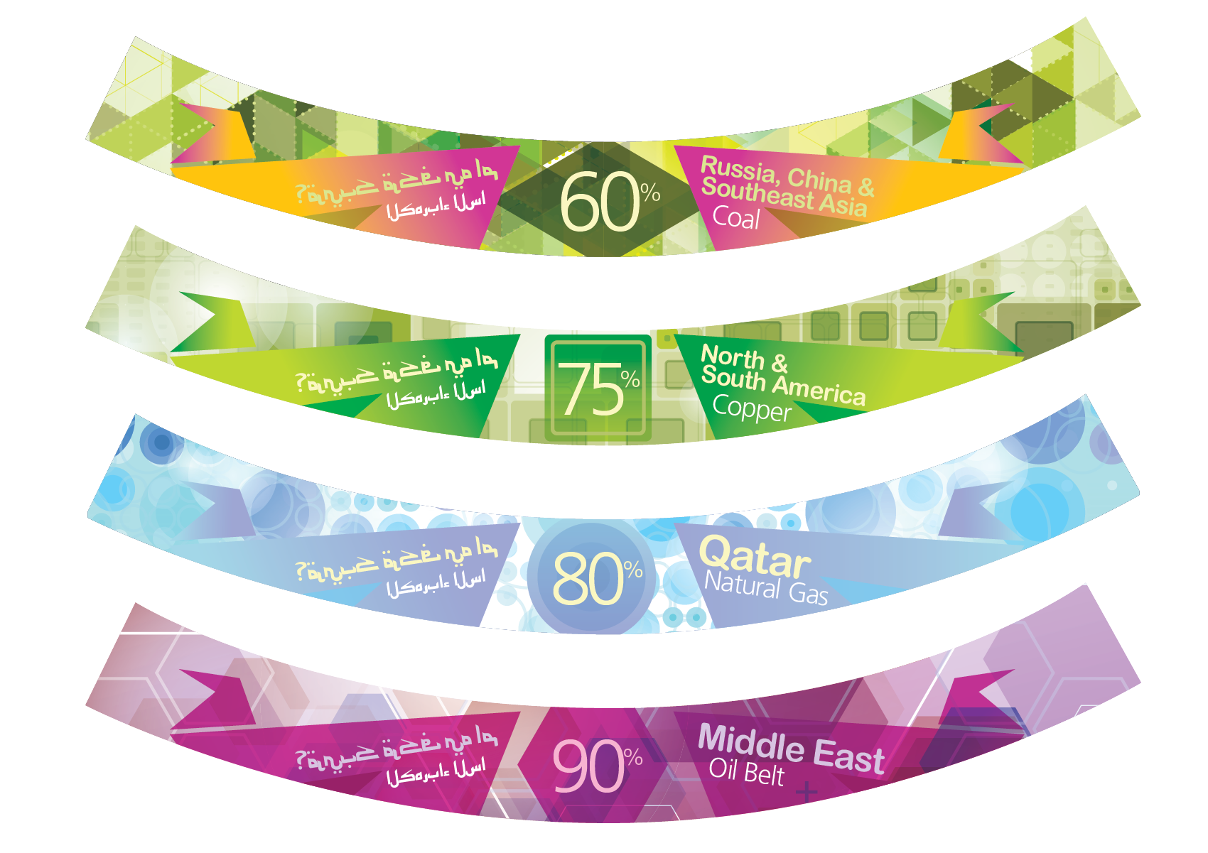
**Qatar Museum – Large Backlit Panels** Series of four image-driven backlit panels, each designed as a variation on a unified visual system. These panels combine photography, illustration, and information graphics at a substantial scale, balancing immersive imagery with clear educational content. Their backlit presentation heightens contrast and color, turning each panel into a luminous focal point within the exhibit.Work In-Progress – Qatar Museum Large Backlight Panels | Four Image Based Versions w/an option for the top version.
More advanced designs based around imagery and information graphics. These are rather large and backlit.
Another take coming soon!
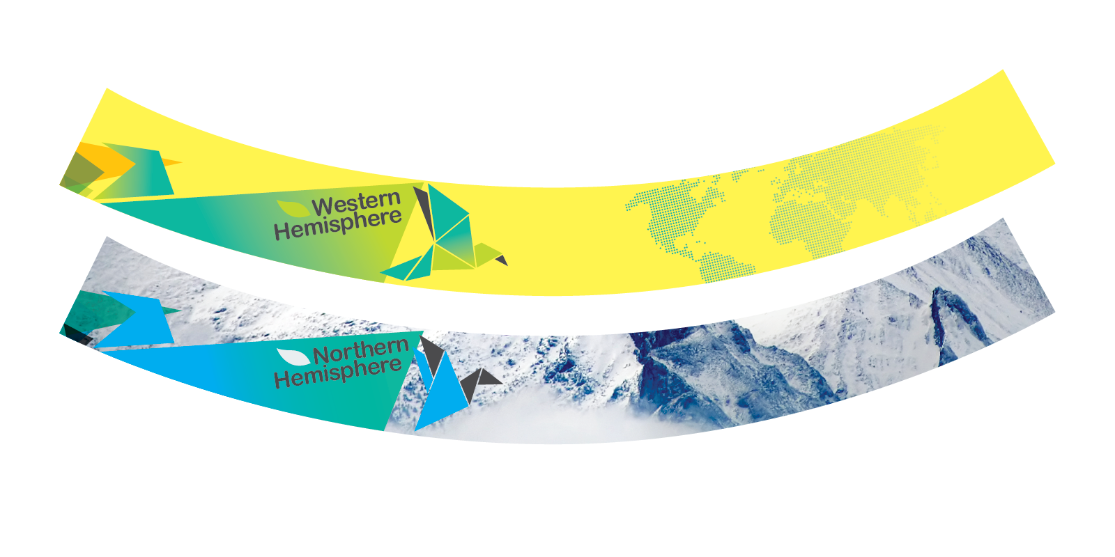
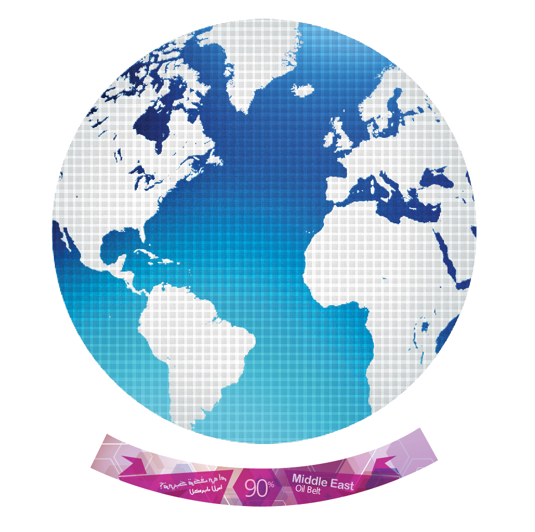
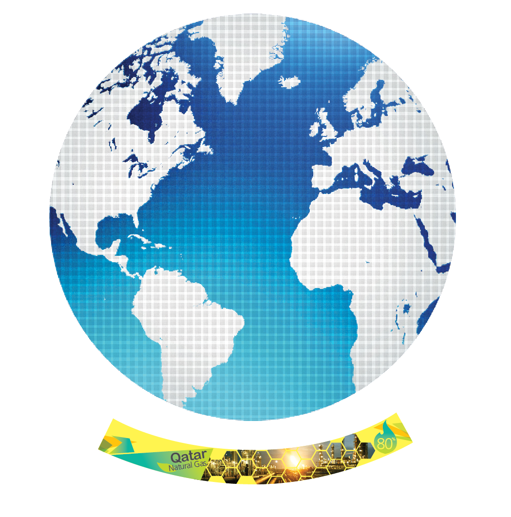
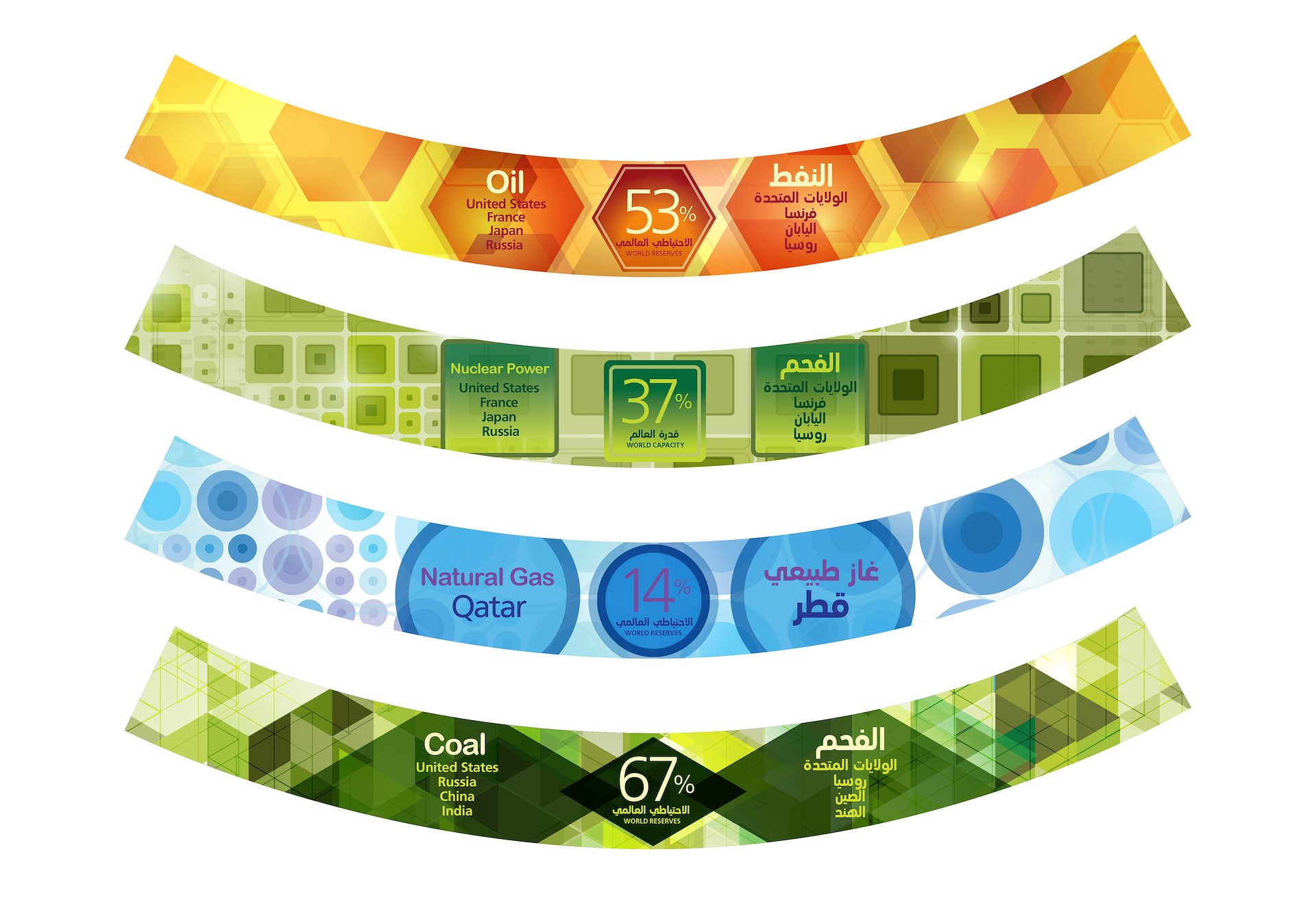
These curved, backlit panels are installed around the base of a large revolving LED planet, which serves as the centerpiece of the exhibit. Between each panel, interactive monitors explain the energy resources and green technologies associated with different regions. To help the client visualize how these elements would work together, I created a simplified graphic representation showing the relationship between the panels, the planet, and the surrounding interactive displays.
/background(fff)/1920x1242.jpeg?auto=webp)
I also designed ground-floor guide graphics for the paid entry area, creating large-scale directional elements that help visitors understand where to queue, check in, and begin their experience. These graphics were treated as part of the overall environmental system, combining clear wayfinding with a visual tone that matched the rest of the exhibit.
/background(fff)/1920x1242.jpeg?auto=webp)
/background(fff)/1920x2967.jpeg?auto=webp)
Additional work included kiosk design, starting from Check-In/Check-Out kiosk spec drawings and on-site fabrication photographs. I used these as a base to visualize applied graphics directly on the kiosk forms, themed in an aquatic “Qatora” color palette and graphic language. This ensured that the final kiosks felt integrated with the broader exhibit branding while remaining functional, legible, and easy for visitors to use.
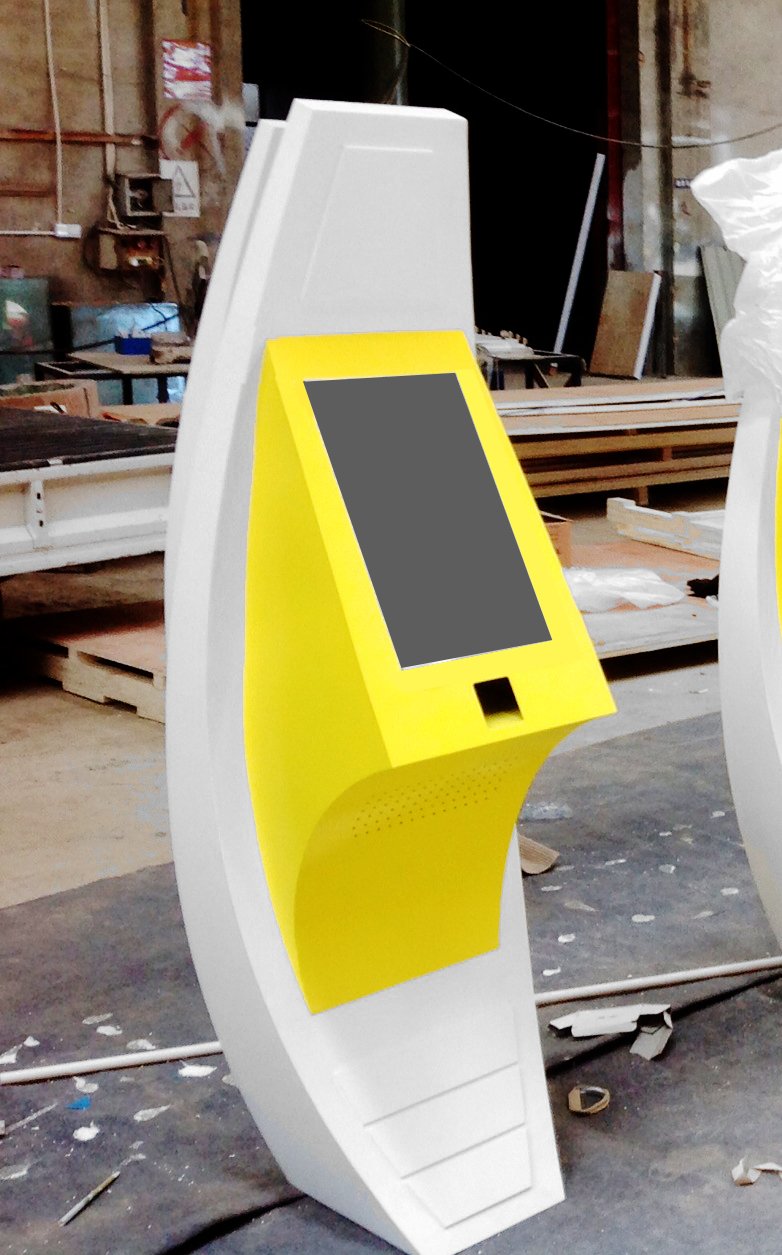
Fabricated kiosk photograph at site.
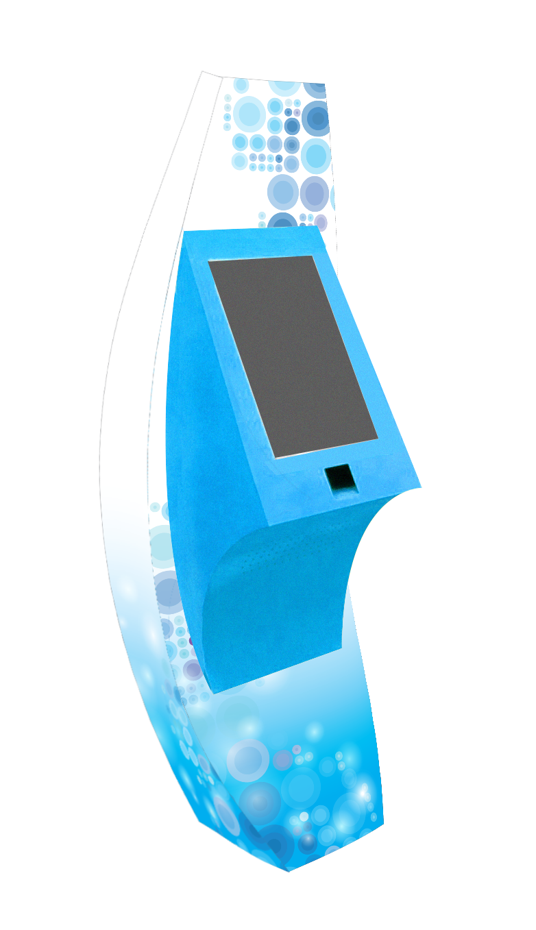
Graphics visualization based on the fabricated kiosk photograph themed in an aquatic ‘Qatora’ theme.
/background(fff)/1920x2475.jpeg?auto=webp)
/background(fff)/1920x2475.jpeg?auto=webp)
/background(fff)/1920x768.jpeg?auto=webp)
/background(fff)/1920x2559.jpeg?auto=webp)
/background(fff)/1920x678.jpeg?auto=webp)
/background(fff)/1920x1052.jpeg?auto=webp)
/background(fff)/1920x1518.jpeg?auto=webp)
/background(fff)/1920x1675.jpeg?auto=webp)
/background(fff)/1920x1151.jpeg?auto=webp)